Monday, 30 October 2017

Case Study of Chris Applebaum (music video director)

Chris Applebaum is an American music video director, who has worked with a diverse range of artists, among them , Rihanna, Natasha Bedingfield, Miley Cyrus, Demi Lovato, Selena Gomez and Britney Spears. He has also directed commercials, most notably the notorious Carl's Jr commercial featuring Paris Hilton. Thirty of his music videos have become #1 on MTV and he also won MTV's Music Video of the Year in 2007.
Chris Applebaum was born in Los Angeles and studied film at Hampshire College in Amherst, Massachusetts where he started directing music videos for bands in the burgeoning independent alternative rock scene in the 90's. After seeing one of Applebaum's early videos, MTV offered the 19-year-old college student the opportunity to join their On-Air Promos department in New York City. At 21, Applebaum became the youngest director to sign with Satellite Films, a division of the legendary Propaganda, where he directed over 250 videos and garnered multiple MTV Music Video awards and nominations. In 1998 Applebaum directed Semisonic’s video for “Closing Time,” which was the first video to be inducted into the Rock & Roll Hall Of Fame in Cleveland and was heralded by MTV as a “Breakthrough” video. His video for Fountains of Wayne’s “Stacy’s Mom” was his second video to be inducted into the Rock & Roll Hall Of Fame and was also nominated for MTV’s coveted Viewer’s Choice Award in 2003.


Within Rihanna's 'Umbrella' music video Applebaum uses symbolic codes to reflect the pop genre. This is shown through the Mise-En-Scene as the video focuses on the Rihanna. The video focuses her appearance mostly and how she is presenting her self image, this includes limited/lack of clothing, revealing skin and position almost in a club/party environment which highlights that "bad girl" vibe which is expected from an audience The genre is also highlighted through cinematography as a variety of shots are used to advocate the artists control over the camera. A range of close ups and mid shots are used to emphasise the power of the artist along with her importance in the frame which suggesting she is fighting back. These shots are essential to the video as they present the artist and those surrounding her as of less importance and authority. The close-ups show a clear representation of audience expectations of how woman present themselves in society with the heavy makeup and revealing clothing. In regards to editing the director creates an image that influences the audience’s opinions on the video. Within this specific video, eyeline matches are used in order to really engage with the audience and meet their expectations.


Target Audience

Conventions of the Pop genre

CONVENTIONS:

  • Artists are clothed in fashionable, stylish and mainstream outfits
  • Artists are portrayed as happy, enjoying and content with life
  • The lyrics are normally based around love or a relationship
  • Often bands express the unity associated with teens, which is the main target audience for this genre 
  • The genre is normally conveyed through the Mise-en-scene and setting
  • Pop magazines are often themed with bright and bold colours which are normally associated with positive vibe
Another convention of the Pop genre is that within the music industry it tends to follow current trends rather than being independent and making something new, unique and different to hear. The form of the song normally follows a verse - chorus - verse structure and uses hook lines which are catchy and therefore stays in the audiences mind. Pop music promotion is via radio stations and magazines. In the UK Pop songs are guaranteed to be heard on well known radio stations such as Capital.

IMAGERY:

The songs usually include beats that are very dance - orientated and they are usually stereotypically associated with people in their teens enjoying partying, clubbing and dancing which is exactly what the purpose of Pop music is for. A lot of the imagery created is based off partying and drinking alcohol and smoking as this is stereotypically what teens nowadays enjoy.

ARTIST REPRESENTATION:

Artists (females) are expressed in a very sexual and seductive way, trying to lure the audience in; very show/staged like. However, current artists choose to dress in provocative ways portraying a sexual atmosphere.

HAIR AND MAKEUP:

Hair and makeup used to be used to commutate the artists feelings, views and express a message; playing a major role in Pop music videos. A few years ago makeup and hair wasn't very extreme and was kept quite simple and natural and not seen as a necessity compared to nowadays.


TECHNOLOGY:

Technology recently has been used as a major part of music videos. Animation I used greatly to create an exciting, loud and lively atmosphere. Compared to a few years ago animation in music videos were hardly seen and the artist was the main focus to the camera eye and dance choreography was the main element to a video.

Mise-En-Scene

 
We are exploring what makes creative m-e-s and we trialled a range of ideas to evaluate what would be appropriate or our genre as well as attract our target audience.
 This is our most creative still as it juxtaposes the vibrant colours against the dull colours which allows the viewers to decode the message that it is portraying.
Another reason why this is our most creative still is due to the lights/ mirror presented in the frame, as they highlight to the audience that our music video is based around the performance and image genre, suggesting the video will focus a lot upon the appearance of the artist.
This still links to our music video as we intend to use vibrant colours and dim lighting to present a party atmosphere , to highlight the performance genre and give our target audience an environment to relate to fulfilling their expectations.


This is our least creative still as there are features within the frame such as people that are irrelevant to the shot, making our location very unimaginative. Another reason why this is our least creative still is because the still  doesn't present our genre clearly or provide any information to the audience as to why this is a relevant location for our music video. This shot is subverting audience expectations as they would expect the still to have meaning or have the mise - en -scene relate to our research.


Sunday, 29 October 2017

Lip Sync Practise Overview


We were given the task to practise lip syncing to our chosen song "Empty" by Olivia Obrien. We wanted to see if we were able to match up the song and Cherry at the same time and also to make it look as if she was actually the one singing the song which is very important. We filmed it a number of times to get the hang of lip syncing. In terms of editing we added a black and white filter to represent our genre and give a clear idea to the audience to reflect her emotions.


WWW: I think that we matched the song to the lip syncing very well to the extent where it looks like Cherry is actually singing the song


EBI: Overall the lip syncing is a bit boring as Cherry is just standing there singing therefore to improve she could do some actions to represent the lyrics and pop genre more.

Planning


via GIPHY

via GIPHY

via GIPHY


via GIPHY

via GIPHY

via GIPHY

Saturday, 28 October 2017

Technical Codes - Conventions of a Pop Genre

Rendered image.png20171128 6 1d814th   I used Postcreator to show the technical codes that are expected within a Pop Genre music video. Each example represents either a cinematography or editing technique that are commonly used to convey a message or help the audience understand the artist and the purpose of their video.


Thursday, 19 October 2017

Semiotics - Will.I.Am (Bang Bang) and Olly Murs (Dear Darlin')

                            I used Prezi to analysis the semiotics of Will.I.Am (Bang Bang) and Olly Murs (Dear Darlin') music videos. This analysis helped me to understand more about why the editing of a music video is important to the representation of the video and image of the artist.

Tuesday, 17 October 2017

Genre Analysis


Similarly, to our song choice 'Empty' by Olivia O’Brien, the music video to ‘Sorry Not Sorry’ by Demi Lovato uses the same symbolic codes to indicate a pop genre. This is shown through the Mise-En-Scene (M-E-S) as the video focuses on the female singers, due to them sharing their emotional state, however the video focuses on the female’s appearance mostly, which is obvious due to the lack of clothing, revealing skin and position in a party environment highlighting the reckless behaviour which is expected from an audience. In addition to this, the video focuses a lot on the irresponsible way of life, this is highlighted through the props such as alcohol, loud music, drugs and intimate relationships that are carried out which meets the audience’s expectations.

The genre is highlighted through the cinematography as a variety of shots are used to suggest the artists control over the camera. Low angles are used to highlight the power of the artist along with her importance in the frame suggesting her careless and unsympathetic nature. Close-ups are essential within the video as they present the artists and those surrounding her as overwhelmed, irresponsible and unconcerned about the outside world as the chaotic atmosphere separates them from reality. The close-ups also show a clear representation of audience expectations of how a young woman presents herself in society with the heavy makeup and revealing clothing.

Editing is controlled the director to create an image that influences the audience’s opinions on the video. Within this specific video graphic matches and jump cuts are used to show a timeline of the artists chaotic lifestyle influencing the audience to believe the artist is driven by excitement and overwhelming atmospheres. Live footage from the artists house party on the 29th June is featured within the video, eyeline matches are used in this video as some of the footage was taken by the artist meaning the audience are watching parts of the video from the audience’s point of view. By using live footage, it creates a more realistic style to the music video presenting what occurs at many house parties which most definitely meets audience’s expectations.


Cinematography is key in helping the audience understand that the artists is stuck in a fantasy when in the hotel room as the panning suggests her incapability to escape and be free of the love-sick nature surrounding her making her seem week. However, the panning later suggests how she is an independent woman, who can free herself from heartache due to her quick movements leaving the hotel room and reappearing later as a friend telling another love-sick female to follow her ‘New Rules’ on how to avoid heartbreak. This links to Levi Strauss' theory as the artist has now switched positions showing she is the opposite to what a normal woman's reaction would be after a heart-breaking experience,  as an outsider now looking in on her own mistakes which the audience would not expect. In addition, close-ups are used to present to the audience how the artists state of mind is changing as she seems less bothered about the relationship that was overwhelming her emotions and isolating her from society.

In the music video, the artist along with the other actresses involved are dressed in brightly coloured, summer clothing suggesting that the song is about a summer romance, furthermore the vibrant colours act as a binary opposite as she is being negative about a previous relationship. On the other hand, the costume is used as semiotics to make the audience see the young females as sexual objects due to the limited clothing and dance routines carried out. The set adds to the summer like style being created due to the pool, flamingo accessories, cocktails and palm trees reflecting a calm nature, which the music video drastically steers away from.

Long shots occur often within the music video as the camera follows the artist to show her fast pace movement around the set, as well as this choral movement occurs in the video meaning that long shots are essential in order for the audience to understand the purpose of her actions.


The editing technique ‘split screen’ used within this music video suggests that its opening the doors to the artists new identity as she has become violent, aggressive and heartless due to a conflict that has occurred. This is obvious due the lyrics ‘I’ve got a list of names and yours is red, underlined’(links with her red outfit) matching a Todorov narrative theory suggesting this is her resolution to the disruption. Another editing technique used is ‘Match on Action’ this is shown on the lyrics ‘all I think about is karma’ where the artist is swinging a baseball bat with a gritted facial expression. This suggests to the audience that the artist is interested in her image as a message is being sent to those who have had conflict with her.
Interestingly, the artist has gone against audience expectations in parts of the video as men are wearing heels along with limited clothing matching the artist, therefore suggesting that she isn’t a woman to be preyed upon within the video. In addition, there is a variety of costume and makeup to portray the different identities that have risen due to the conflict, which also goes against audience expectations as the women tend to be fragile objects in music videos about a domestic.

Vibrant along with dark colours have been used in the music video, the director uses the colours to catch the audience’s eyes for example at the end where the artist writes ‘Reputation’ in neon pink on a black plain suggests that reputation is the key element in the video as at the beginning ‘Taylor swift’s reputation’ was written on a gravestone. Within the video ariel shots are used when looking down at the artist in a bath tub full of jewels highlighting her desire for diamonds and fame. When the artist is swinging in the bird cage the camera zooms out on the lyrics ‘you locked me out’ suggesting the abandonment the artist experienced which leads to her destructive nature.

From these music videos we can use the idea of vibrant colours contrasting with darker colours for our set and costume to present a specific image or concept to indicate to our audience the narrative we will be following for our music video. Along with this a variety of editing techniques to highlight key moments in the video, or to link back to a previous shot so we know the audience still have a clear understanding of the artists purpose.


Tuesday, 10 October 2017

Vlog Pitch Feedback


Here are the images of the Vlog Pitch feedback sheets which our peers filled out during our lesson. Their task was to evaluate how well we had provided information about specific areas for our music video, including what editing techniques would be used along with the choice of costume we thought would be appropriate fro our genre and why.

Vlog Pitch

Monday, 9 October 2017

Vernallis' Theory

           
Our decision to make our sequence non chronological, with a variety of effects shows how we are challenging Todorov's theory. The blue tone feature on our resolution still represents the cold nature of the image highlighting the depression that surrounded the young girl leading to her accident. In contrast to this our equilibrium still is now edited with a warm tone and titled squares effect to symbolise the childlike nature of the image. Finally, our disruption still now has a scrape effect in order to distort the image suggesting the conflicting society that surrounds the young girl has led to her rebellious lifestyle, as she can no longer conceal her true identity.

Todorov's Theory Sequence - Chronological


In this sequence, Todorov's theory of being a clear narrative is being used and shown through an equilibrium, disruption and a resolution.

WWW: The narrative can be understood successfully by the audience and is very simple for them to follow 

EBI: This sequence would have been better if we extended it and added more stills to give the audience an even clearer representation. We could also have made vast adjustments in postproduction to improve the stills.

Sunday, 8 October 2017

Existing Record Label Company Research

Image result for republic recordsRepublic Records is a record label that is partnered with Universal Music Group (one of the Big Three along with Sony Music and Warner Music Group) who focus on popular, new music revolving around artists such as The Weeknd, Lil Wayne and Drake. In addition to this Republic has expanded to release high-profile soundtracks for notable films such as Fifty Shades of Grey and The Hunger Games along with television franchises such as The Voice (NBC TV).
Image result for rca record label


The RCA Label Group UK is a flagship recording label of Sony Music Entertainment, which has existed from 1919. The label has a history of working with legendary artists from Elvis Presley, David Bowie to current UK/US artists such as Miley Cyrus, Olly Murs, Justin Timberlake, Beyoncé and Paloma Faith.


Image result for atlantic recordsAtlantic Records was founded in 1947 by Ahmet Ertegun and Herb Abramson, their passion for artist development made Atlantic Records the home of choice for legendary artists including Led Zeppelin, Ray Charles, The Rolling Stones, Cher and Genesis. Even after over 60 years of recorded music history a new generation of incredible artists including Bruno Mars, Coldplay, Ed Sheeran, Hunter Hayes and Wiz Khalifa continuing the legacy.


Narrative Theory

Binary Opposites
Levi Strauss' theory explains how all conflict within the world come about due to Binary Opposites and that the world only makes sense because of the opposites we are surrounded by.
  • Reality VS Fantasy - 'That's just reality' We would use the element lighting to create either a  vibrant or dull image showing a clear representation of reality vs fantasy within our video.
  • Day VS Night - 'Wish there was no tomorrow' - Highlighting the concept of time
  • Common themes - loneliness/jealousy Present to the audience that the artist feels trapped within society, however presents a new identity at night (sense of enjoyment/freedom)


Todorov's three stage theory

Equilibrium - Represents the happy/normal aspects of the video

Disruption - Issues that arise within the video

Resolution - Issues being resolved with the video ending 'happily ever after'

Friday, 6 October 2017

Genre Representation


Our first sequence links to the pop genre, this is shown through our choice of costume as it is casual however creates an image for our artist which is also highlighted through the use of hair style and makeup.
Our second sequence links to the rock genre, this is shown through our choice to use music instruments to construct an image of our artist. The choice of instruments fulfils audience expectations, codes and conventions as seeing the band/instruments is a common theme used in indie and rock music videos.
Overall, the first sequence fits our song choice the best as the image of the artist would attract a female artist as well as our lyrics due to the relatable issues.

Research - School locations


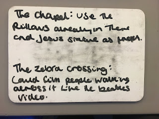
Our task was to do some planning about the locations we would use around school if our only choice was to film our music video at school. This task helped us to think about appropriate locations for our pop music video as well as the editing techniques that we would use.

Audience representation of artist

                   We decided to show our target audience our song choice, without letting them watch the original music video, this was so the we could get them to draw or write out a representation of the artist that they thought was appropriate for the music video.
Surprisingly, their blind representations weren't that far off the correct answer, we believe this was positive feedback as it confirmed our ideas and target audience as we now know the audience would have a clear understanding of the representation of the artist when they see our recreation.

Green Screen Practise


Here is our attempt at experimenting with the green screen and the techniques that can make non naturalistic backgrounds. We enjoyed this task as we gained a further understanding of why artists use the green screen in their videos or why it is an appropriate prop within particular genres.
We've realised that we needed to be further away from the green screen when filming in order for the image to be more realistic as at some points the screen can be seen.
We are not keen to use the green screen within our video however, if we were going to use it we would use it to create a party atmosphere to place our artist in as she refers to getting drunk and lost within society. Another idea would be place our artist somewhere high as if she was looking down on the society that she feels pushed out of.


Music Video