This music video had a powerful storyline, making it a narrative music video. I particularly liked the text at the beginning as it is very aesthetically pleasing and simple, with blurred our fire burning that is showed behind it. The quality of this music video was excellent and they didn't need a massive budget to produce this. The most creative scene was the two wires connecting part. There was a variety of shots, but most were invisible, as it didn't need to cut to the beat. The editing with the overlaid bird at the beginning, made it unique and interesting and I think that they put a blue tone onto the clips to continue the sense of sadness and depression inside the characters and can reflect on the audience.
Sunday, 31 December 2017
Analysis of Videos Produced by Other Students
This music video had a powerful storyline, making it a narrative music video. I particularly liked the text at the beginning as it is very aesthetically pleasing and simple, with blurred our fire burning that is showed behind it. The quality of this music video was excellent and they didn't need a massive budget to produce this. The most creative scene was the two wires connecting part. There was a variety of shots, but most were invisible, as it didn't need to cut to the beat. The editing with the overlaid bird at the beginning, made it unique and interesting and I think that they put a blue tone onto the clips to continue the sense of sadness and depression inside the characters and can reflect on the audience.
Editing, Shot types and M-E-S Ideas
The opening shot is of the bands logo, Clean Bandit. The logo on fire foregrounds the action and concept of the video. The four shapes help symbolise the four artists within video. The video also ends with the same logo and this is used as a form of conclusion. Putting it at the end also helps the viewer remember the band as it is the last thing they see.
The mid close up at 0:10 seconds is of the main singer, Louisa Johnson lip syncing is within the middle of the rule of thirds. This suggests how she is central to the concept and is the attention focus. The use of the reverse effect is unique and not used often therefore grabs the viewers attention and in this case we might use this effect within our own video.
This long shot at 0:29 - 0:32 is of the owl flying away in slow motion and is reflective to the lyrics "falling in slow motion". This can be used as a metaphor to convey the message of the song. We could use this idea and use editing techniques such as slow motion or speeding it up to reflect the state of mind our artist is in or reflect the lyrics.
At 0:50 there is a long shot of a heart bursting into colours. This can be suggestive to the explicit meaning of a heart break from a hurting relationship but it can also connote the expressiveness of the artist coming through now that they've been through pain. I would like to use coloured smoke flare in our music video as it is unique and would be highly appealing to our target audience. I would preferably use the colours red and blue like they have done in this video as it can portray that the artist has gone from being in love and passionate to detached and cold.
At 1:08 the mise-en-scene helps portray the star persona of the artist. Both the females in this long crowd shot are wearing conventional revealing and skimpy costume. This represents women as passive and sexual objects. Whereas the males are wearing casual t-shirts and are dressed down, not making them eye catching. The quick cuts and fact paced editing used throughout the video is effective at showing the artists thoughts and feelings. They are letting out their anger about the relationship. There is chiaroscuro lighting used in the video to highlight certain aspects. In the close up at 1:25 it is the fire in the artists hand. This also creates a tense and exciting mood and atmosphere for the audience.
Music video bloggers
There are loads of people that "react" to different music videos that get millions of views, especially if they're famous channels. This promotes the singer's song to vast amounts of people who watch the person's reaction videos. This is the main advantage. Another advantage is that the song is played along with the person reacting to it, so for example if the viewer liked the song, then they can search it up on YouTube and listen to it for themselves, or even buy the song, making sure the sales for the song rises. However on disadvantage of this process is that some people generally don't like watching "reaction" videos however for our music video it has to fit with the "trend" of music videos or be something unique to make people want to watch it.
Top Strategies that a band in our genre has used to promote their music:
- Mini documentary - Document the story of your band. This is interesting for those people who weren't able to go watch them live when their favourite band/singer was in a city near them. This way they can see what they performed live and what they did before and while they were in their city.
- Behind the scenes – Everyone loves a glimpse of inside the creative process. you can keep your fans invested by showing them behind-the-scenes footage of you writing, recording, putting up posters, fixing your gear,or practicing. These can be very short and very informal. Frequency can be more important than slickness with this approach. This can be very helpful to those interested in what equipment they use and how they film their favourite artist.
- Interviews – Fans don't lover anything more than to hear about the inspiration for songs, the meaning behind lyrics, the band chemistry, the drama, the highs etc. For this you can get someone you know to interview you, or interview yourself. This is a really good strategy as fans like to know interesting things about their favourite band/singer and these interviews are a good way to find these facts about them and their music.
- Encourage fans to record covers of your songs – This way the song will be promoted to an even wider audience https://youtu.be/1dl-ooknk1U
If we were going to promote our music video, I think that having interviews, mini documentaries and getting people to cover the song are the best ideas. I think that using these strategies is this way for more people to find out about it as there would be more videos covering the song. As our genre is pop, it will be more successful as most people like pop music as it is more popular and so they will find out about it easily.
Saturday, 30 December 2017
Props
Here I have made pinterest boards of some props/ costumes that we might incorporate in our music video that we are going to create. As the song is called 'Empty' we thought we could use empty alcohol bottle to resemble the emptiness the artist is feeling. As of this video, we are still working with the song and learning the lyrics to practice lip syncing. These ideas aren't final that we are using in the real video as we are still thinking of better ideas and this was the first idea that came into my head. In regards to the costume I thought we would go for the more grunge look as when listening to the lyrics some of the lines are quite deep so therefore a more grunge look would suffice.
Friday, 15 December 2017
Music Video 1 - Peer feedback


Tuesday, 12 December 2017
Sunday, 10 December 2017
Magazine ad and CD cover
After discussing our initial ideas for our magazine advert, have decided that we are going to go for the VHS design. We chose this as we felt it resembled our genre the best and it create a enthralling and interesting advert that will draw in our target audience. By carrying out this research, we can develop a better magazine advert that will better target our music genre.
Saturday, 9 December 2017
Thursday, 7 December 2017
Digipack
Part of our coursework is to create a digipack to go alongside our music video. I have done some research into digipaks and how much it contributes to the overall success of the song. Digipak is a
patented style of CD or DVD packaging. A CD digipak is usually folds out to four sections, each featuring different images of the artist or their influences. Digipaks always contains the artist or bands CD, a bonus item, it could be a DVD of their latest tour, posters, bonus tracks ect.
In all, digipaks are designed in a way which is meant to attract fans and target audiences. They must have a aesthetically pleasing cover to attract the age, gender and the type of person who will like and listen to the music . However digipaks are also created for the companies finical interests, unlike regular albums which are easily downloadable from illegal websites, digipaks incise people into buying extra content which gives the artist some worth.
In all, digipaks are designed in a way which is meant to attract fans and target audiences. They must have a aesthetically pleasing cover to attract the age, gender and the type of person who will like and listen to the music . However digipaks are also created for the companies finical interests, unlike regular albums which are easily downloadable from illegal websites, digipaks incise people into buying extra content which gives the artist some worth.
Magazine Advert - First draft
 This is a first draft of what we would like our magazine advert to look like, we have used an image from a photoshoot that we carried out of the artist. This particular image will also we featured on our digipack however, we will edit the image differently in order not to have repetition occurring with our ancillary products.
CD Cover Idea


Here is one of our ideas for an album cover, this cover would be subverting audience expectations as we have used vibrant colours and presented the artist as a model figure whereas the audience would expect dull colours with a vulnerable looking female due to the melancholy song. However, we are fulfilling codes and conventions of a pop genre album cover as they are created to catch the audiences attention and make a bold statement.

We believe this album cover would be more appropriate for our song choice as it reflects our genre and would appeal more to our target audience as this cover fulfils audience expectations.
Magazine Advertisment Analysis


Here we have analysed other artists album covers to have a better understanding of how we should construct our own, to fulfil the codes and conventions of our genre and the expectations of our target audience.
Tuesday, 5 December 2017
Rough Cut Feedback

 From the feedback that we received from our peers about our rough cut (first edition) of our music video, we have come to the conclusion that we need to focus on the creativity of the lighting and props aspect of the video. In addition to this there is room for improvement so that our narrative theory is much clearer for our target audience and we can achieve this through the use of more conceptual ideas.
Furthermore, we have discovered that the editing of our rough cut is extremely creative and intriguing fulfilling the codes and conventions of a pop genre music video. However subverting audience expectations as the lyrics demonstrate a troubled young female meaning many audiences would expect a cold, depressing music video.
Monday, 4 December 2017
CD Analysis

The medical sign placed in the title suggests to the audience that the artist has placed himself on a road to recovery and time alone to think will be enough medication to heal the pain that is occurring in his life. Due to the title being 'Recovery' the audience expect the issue to be a drug or alcohol addiction.
Subverting audience expectations the artist is being represented as someone who wants to become a better, independent figure in society rather than giving into the addiction and creating a revolting personal image. The calm, subtle atmosphere represented on the album cover also subverts audience expectations as they would expect a more sorrowful or violent cover due to the troubling mindset being experienced by the artist.
Instantly, it is obvious who the target audience is due to the Parental Advisory Explicit Content label placed in the right hand bottom corner of the album cover, suggesting that the artist has struggled to express his pain in a subtle/ calm way which fulfils the codes and conventions of a rap artist.

In order for the title to stand out on the spine of the cover, it has been printed in a bold font in black against a white background along with the artists' name in brackets to signal its a personal album as well as making it obvious who the artist is when in the shops.
Similarly, to the title the songs featuring on the back of the album cover are in bold, white font to stand out as well suggest the importance of each song.
Strangely, the image on the back of the cover shows the artist sitting in perhaps his house or apartment however, the walls have been replaced with landscapes of the outside world suggesting that the artist is hallucinating due to the addiction that is trapping him.
:format(jpeg):mode_rgb():quality(90)/discogs-images/R-1549636-1265948094.jpeg.jpg)
The band name 'Metallica' is edited to appear 3D in a large font, in the middle of the top of the album cover representing a heavy mental genre. In addition to the album being called 'Master of Puppets' many strings are attached to the band name title portraying they are the puppet masters of the world/ underworld due to the strings holding onto grave stones. Fulfilling the codes and conventions expected both the band name and album name are placed on the front cover, however are in different fonts.
Dark, bold colours are used portraying a violent, deadly atmosphere that would stand out to a particular target audience as heavy mental is not the most popular genre.

On both the front and back covers the titles are the same as well as this song names are in a similar font and bright white in order to stand out against the red background.
Differently, from other albums each song is numbered with time references in order to notify the target audience on the length of each song, which perhaps can convey a message about each song.
CD analysis


The front of the CD looks like she is at a fairground which gives the CD cover a fun/exciting image. The front is important for this cover especially as it adds a carnival look to the cover which detracts from the more carefree atmosphere. This album is conventional for a pop artist, especially a stereotypical female pop artist because of the powerful image used and the connotations we are getting from this cover. The cover overall is very striking and it accentuates the artists bold and colourful image

The front looks somewhat handwritten which gives the idea that she is very fun and doesn't care about how it looks, it also comes across as quite childlike in a sense that she has doodled some of the letters in a way that a child might. The artist is introduced with a close up image which is conventional for a pop artist, the black and white filter makes the gold a very central colour for the album artwork which gives the idea of wealth and fame. This particular colour choice is something I have noticed on many female pop artists covers.

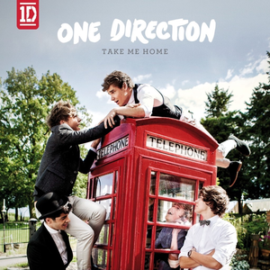
The front cover adds to the theme of the artist album 'Take me home' as it is like they are climbing on the telephone box in an attempt to find their way home. The back cover displays the artists carefree attitude because there are some hand drawn stars on the back which adds to the child like feeling of the cover and gives a sense of having a playful attitude which is good for the type of audience they are targeting.
Subscribe to:
Posts (Atom)

-
We have chosen these props as we feel that they are the most relatable and fit best with our pop genre and conventions of our video. Our vid...
-
The front of the CD looks like she is at a fairground which gives the CD cover a fun/exciting image. The front is important for this co...
